Tag Archives: GameRoomDecor

Why “Life Is Too Short” Deserves a Spot on Your Wall 🎯

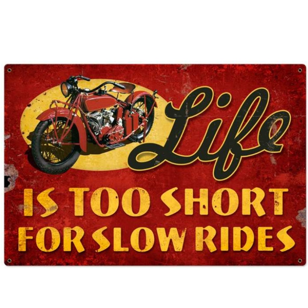
Sometimes, great décor isn’t just about looks — it’s about the vibe, the message, the energy you bring into a space. The Retro “Life Is Too Short” Tin Sign (36″ × 24″) is more than just wall art — it’s a statement. With its bold wording, vintage metal finish, and generous size, it reminds you every day that life is short: enjoy it, make it count, and surround yourself with things that matter.

Built to Last — Genuine Steel, Real Value 🇺🇸🔧

When you pick metal wall art, quality matters. This sign delivers:

  • 🏭 Crafted from heavy-gauge American steel — sturdy, substantial and long-lasting.
  • 🎨 Durable finish application that keeps the graphics sharp and vibrant over time.
  • 🛠️ Oversized dimensions for serious visual presence — 36″ wide by 24″ tall.
  • 🪛 Indoor-ready design that fits seamlessly in your home, garage, bar, or game room.

This is décor that isn’t just decorative — it’s built to stay.

Visual Impact — Large Format Means Statement Wall 📐🏠

The big 36″ × 24″ size makes this sign a natural centerpiece. Consider hanging it:

  • Above a bar or counter to set the tone for your home tavern or lounge.
  • On a garage wall above shelving, workbench, or near vehicle displays to combine function and flair.
  • In a game room or media space — where it can serve as a backdrop to good times and conversation.
  • As part of a feature-wall gallery, paired with complementary metal signs, framed prints, memorabilia or industrial décor.

Because of its scale, it doesn’t blend in — it stands out.

A Message Worth Displaying — Nostalgia, Inspiration, Attitude 💬✨

The vintage look and “Life Is Too Short” phrase strike a tone that’s part retro, part rebellious, part thoughtful. It resonates with:

  • Anyone building a personal space that reflects values — living boldly, enjoying the moment, embracing freedom.
  • Garage or workshop owners who want décor with edge and meaning.
  • Individuals who love retro, industrial or vintage-inspired interior style.
  • Gift-givers looking for large-format, meaningful décor items that resonate emotionally.

Why This Sign Makes Sense for You ✅

  • Instantly lifts a blank wall into a feature with character and soul.
  • Heavy-duty construction gives you confidence in longevity and value.
  • Size and style make it versatile — from casual spaces to themed décor rooms.
  • A meaningful décor piece with a message you can stand behind.
  • Easy to hang and integrate — no hassle, just instant impact.

Style Tips to Make It Pop 💡🎨

  • 🎯 Hang against dark or neutral-colored walls (charcoal, navy, industrial grey, brick) to let the metal and graphics pop.
  • 💡 Add ambient or accent lighting — a warm overhead light or wall-mounted directional light can amplify the vintage metal finish and casting soft shadows.
  • 🧰 Pair with complementary elements: metal shelving, industrial lighting, vintage gear, framed retro posters — to build a cohesive thematic space.
  • 📏 Position at eye level or slightly above furniture/bar top to maximize visibility and impact.
  • 🪞 Keep surrounding area tidy so the sign remains the focal point — statement pieces deserve breathing room.

Final Thoughts: Decor That Speaks, Not Just Sits 🏁

If you’re tired of wall décor that fades into the background and want something that reflects energy, attitude, and thoughtful craftsmanship — then the Retro “Life Is Too Short” Tin Sign is exactly that kind of piece. Oversized, meaningful, built to last, and ready to become part of your story.

Don’t just decorate — make your wall speak truth.

SHOP NOW!

Why This Wall Piece Brings More Than Just Flavor 🧲✨

When you choose wall décor, it’s about more than aesthetics—it’s about setting a tone. The Retro French Fry Metal Sign (18″ × 20″) does exactly that. With its bold design, food-themed imagery and premium American steel build, it transforms a wall into a statement piece—not a background.

Built With Craft & American Materials 🇺🇸🔧

Quality in décor shows. This sign delivers:

  • 🧲 24-gauge U.S. steel construction offers solid physical presence and durability.
  • 🎨 Dye-sublimated artwork baked into a powder-coated finish gives vivid color and helps prevent peeling or fading.
  • 💪 Indoor-use only specification to protect the finish and keep imagery sharp over time.
    These features make the sign a long-term décor investment, not just a quick buy.

Format & Placement That Work Well 📏👁

At 18″ wide by 20″ high, this format gives you:

  • Enough size to be a visual anchor, yet manageable to mount in many settings.
  • Ideal locations: above a snack bar, near seating in an entertainment room, in a kitchen wall display, or a café counter backdrop.
  • Balanced scale ensures the sign becomes a focal point and not just another wall element.

Design That Embraces Food Culture & Retro Vibes 🖼️🍟

The vintage illustration of French fries and diner-style typography injects fun and personality into a space. It’s especially suited for:

  • Kitchens or cafés that lean nostalgic or food-lover focused.
  • Game rooms, man caves or entertainment zones where snack imagery ties into the vibe.
  • Retail or hospitality spaces looking for friendly décor that says “relaxed, fun, food-forward”.
    It’s décor that invites conversation and adds charm.

Why You’ll Appreciate This Choice ✅

  • Instantly upgrades a plain wall into a visual and thematic feature.
  • Built in the U.S. with heavy steel—giving you value, durability and authenticity.
  • Good format for many spaces without feeling too large or too small.
  • Fun and meaningful design—ideal for food fans, retro décor lovers, café owners, or anyone wanting a bold accent.
  • Easy to integrate into themed décor or use as a standalone statement piece.

Styling Tips to Maximize Impact 💡📌

  • 🎯 Mount on a wall with a background colour that allows the bright imagery to pop (cream, light grey, pastel tones).
  • 🔦 Consider adding a directional LED strip or spotlight to accentuate the metal texture and print finish.
  • 🧁 Pair with other food or snack-themed décor: vintage drink signs, metal shelving with jars of snacks, neon-style accent lights.
  • 🪛 Hang at about eye level or just above a bar/counter for best viewing.
  • 📏 Leave some breathing room around the sign so it remains the focal piece rather than lost among clutter.

Final Thought: Décor That’s More Than Looks — It’s Character 🎯

If you’re ready to choose wall décor that delivers personality, build-quality and a bit of fun—then the Retro French Fry Metal Sign (18″ × 20″) is a strong contender. It doesn’t just camoflauge a wall; it commands it.
Choose decor that reflects taste. Choose craftsmanship you trust.
Let your wall serve up style.

SHOP NOW!

A Piece That Brings Nostalgic Vibes and Lasting Build 🧲🎨

When you choose wall décor, you’re not just selecting something pretty — you’re setting the tone for your space. The Retro Soda Pop Metal Sign (15″ × 21″) does both: it brings retro charm and solid construction. With its American-steel build and soda-shop inspired design, it elevates your décor with personality and quality.

Crafted with American Materials and Attention 🇺🇸🔧

Quality matters in décor, and here’s how this sign delivers:

  • 🧼 Made from 24-gauge U.S. steel, giving real presence and durability.
  • 🎨 Artwork applied via dye-sublimation into a powder-coated surface—so the image remains sharp and vibrant.
  • 🏠 Indoor-use only specification ensures the finish and graphic stay protected and clear.
  • 📏 Sized at 15″ × 21″ and weighing approx 3 lbs — substantial enough to impress, yet manageable to install.

Size & Placement That Work for Many Rooms 📐🏠

With 15″ width and 21″ height, the sign strikes an ideal format:

  • Above a countertop or side-board in a kitchen or dining area.
  • On a wall in a café, soda-fountain themed space, home bar or lounge.
  • In a game room, man-cave or garage where vintage signage adds character.
  • Integrated into a wall gallery of retro metal signs, posters and memorabilia.
    The vertical orientation helps draw the eye upward and fill wall space stylishly.

Design That Smiles – Literally – More Than Just Décor 😄🍹

The friendly soda glass graphic, vibrant color palette and “Soda Pop” phrasing deliver charm and fun. It suits environments where décor isn’t just backdrop but part of the experience:

  • Home cafés, kitchens, dessert bars or snack rooms.
  • Garages or game rooms with a vintage-shop or diner theme.
  • Retail spaces, café walls or themed hospitality areas looking for light-hearted yet quality décor.
  • Gift scenarios for soda-lovers, retro décor collectors or anyone who likes cheerful wall art.

Why It’s a Smart Pick ✅

  • Instantly upgrades wall-space into a curated feature zone.
  • American-made steel construction means value, both in materials and design.
  • Balanced size fits many spaces—impactful but not overwhelming.
  • Image and design deliver nostalgia with style and substance.
  • Great gift option for kitchen lovers, café owners, décor fans, vintage sign collectors.

Styling Tips to Let It Shine 💡🎉

  • 🎯 Mount on a lightly colored or pastel wall (cream, mint, coral) so the bright image stands out.
  • 💡 Add subtle lighting (a small LED strip or directional spotlight) above the sign to enhance the metal’s texture and color pop.
  • 📚 Pair with other retro-themed metal signs, vintage beverage-crate décor or diner-style seating to complete the look.
  • 📏 Hang at about eye level, or slightly above a countertop/bar area, so it commands attention without being obstructed.
  • 🧼 Keep surrounding wall space uncluttered so the sign remains the focal point.

Final Thought: Décor That Pops – Literally ✅

If you’re done with décor that fades into the background, and want something with personality, craftsmanship and color — then the Retro Soda Pop Metal Sign is your choice. It packs retro style, American-made build and versatile placement into one fun piece.
Make your wall more than just a wall — make it pop.

SHOP NOW!